
CircularProgressIndicator は、ローディングや進捗状況を示すために使用されるUI部品の1つです。
これを使うことで、円形のインジケーターを表示してユーザーに作業の進行状況を示すことができます。
目次
CircularProgressIndicatorの基本的な使い方
単にぐるぐる回るローディングを表示したいだけであれば、次のようにCircularProgressIndicator()と書くだけで完了です。
CircularProgressIndicator()CircularProgressIndicatorで進捗状況を表示する
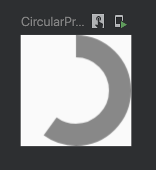
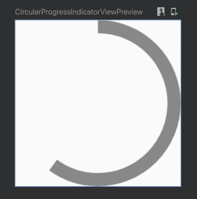
進捗状況を表示したい場合は、引数 progress に0f~1fの値を入力します。
0が0%で1が100%になるイメージです。
CircularProgressIndicator(
    progress = 0.6f
)
この例では進捗率が60%であることを表します。

CircularProgressIndicatorのインジケーターの色を変えるには?
引数 color に色を指定します。
CircularProgressIndicator(
    color = Color.Gray
)
CircularProgressIndicatorの線の太さを変えるには?
引数 strokeWidth にサイズ(dp)を指定します。
何も指定しない場合はデフォルトの4.dpが適用されます。
CircularProgressIndicator(
    strokeWidth = 8.dp
)
CircularProgressIndicatorの全体のサイズを変更するには?
CircularProgressIndicatorのサイズを変更するには、Modifierを使用してサイズを指定します。
CircularProgressIndicator(
    modifier = Modifier.size(100.dp), // 幅と高さを100dpに設定
)
Comment